SENDING THEM ON THEIR WAY
If you include the likes of Nebraska, Rutgers and Maryland just for kicks, then teams that are now currently part of the Big Ten have sent 1,018 players into the NFL since 1990, but of course the typical contributions of individual schools vary significantly. As you might expect, nearly half of those players came from only a few of those schools. Indeed, just a little under half of the total comes from Ohio State, Nebraska, Penn State and Michigan. It takes the contributions of the other ten current members to make of the rest of that.
So, what are we looking at this time, Lorne?
Well, after some of the questions that arose as a result of my last diary, I began thinking that the next level of this analysis was to take a conference – the Big Ten, naturally – and see if there was any interesting pattern not only within the average contributions of the conference to the NFL Draft, but also to see anything interesting in the contribution patterns of different teams since 1990.
This is, of course, where including Maryland and other schools which were later additions to the conference might seem a little dicey, but strangely enough, only Nebraska’s average contribution (nearly five players per draft on average) would affect averages derived here in any significant way. In any case, for certain calculations such as the average total contribution of the Big Ten to the NFL draft, the timeline of entry for schools was accounted for.
SUMMARY DATA:
The table below shows the average number of players taken per year in the NFL Draft as well as the team’s percent contribution to the 1,018 who have been drafted since 1990.
TEAM | AVG. | % OF TOTAL |
OHIO ST. | 5.48 | 13.46% |
NEBRASKA | 4.92 | 12.08% |
PENN ST. | 4.48 | 11.00% |
MICHIGAN | 4.20 | 10.31% |
WISCONSIN | 3.56 | 8.74% |
MICHIGAN ST. | 3.36 | 8.25% |
IOWA | 3.28 | 8.06% |
ILLINOIS | 2.32 | 5.70% |
PURDUE | 2.16 | 5.30% |
MARYLAND | 1.88 | 4.62% |
MINNESOTA | 1.36 | 3.34% |
NORTHWESTERN | 1.28 | 3.14% |
INDIANA | 1.24 | 3.05% |
RUTGERS | 1.20 | 2.95% |
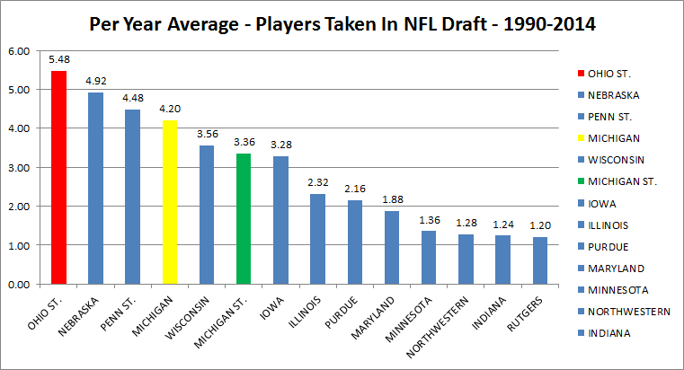
As I mentioned, the top four schools in the above table constitute nearly half of the total contribution of players - 46.86%, to be precise. However, if you extend this to the top seven schools on the list, the lopsided nature of the numbers becomes even more intriguing. Those seven schools comprise 71.91% of the 1,018 players taken since 1990 from these 14 teams.
Another interesting thing that I found in the numbers is something that I assumed but had never really bothered to flesh out statistically until now. With volume contribution comes a certain amount of volatility. What do I mean by that? Well, the most prolific contributor on the list above – Ohio State – also has the widest distribution with a standard deviation of 2.77. The steadiest contributor in that sense is also one of the teams not usually remembered for its contributions to the NFL Draft, and that would be Indiana, which came out with a standard deviation 0f 0.99. Of course, Indiana – on average sends only 1.24 players to the NFL each year, so yeah, only slightly worse than Northwestern.
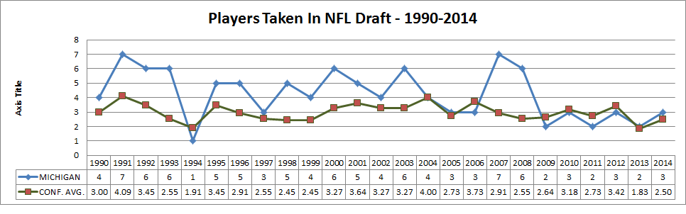
What about Michigan specifically though?
One thing I did was compare total contribution of the team to the average contribution of the conference (adjusted for entry timelines for a few times) and it turns out that, at least until recently, Michigan has managed to exceed the conference average most years:
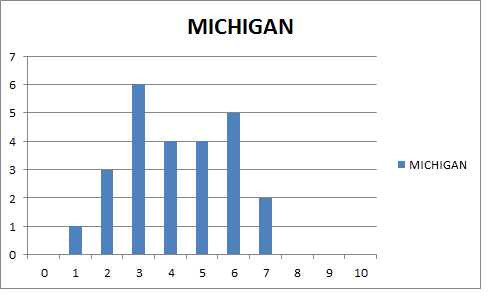
Bonus histogram to show the somewhat bimodal distribution of number of players in a given year:
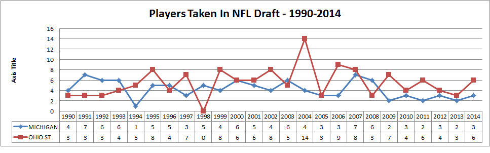
What about Michigan against others?
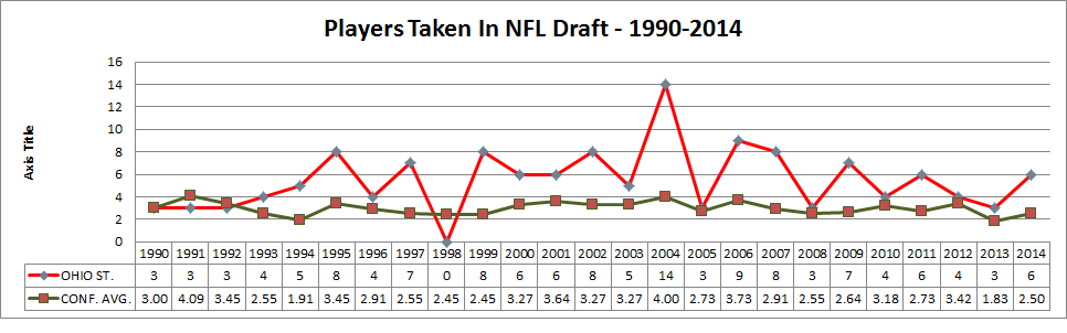
Here’s how we compare to Ohio State in terms of raw totals:
Here’s the three-year rolling average:
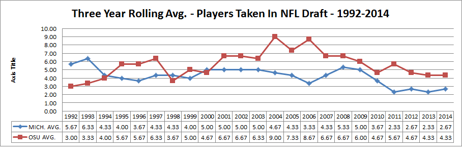
If you look at this one closely, you will notice that it has been quite some time since we’ve outperformed Ohio State when it is analyzed this way. Indeed, 2001 would coincide approximately with a rather successful run in Columbus spearheaded by a man who would resign in disgrace in 2011. It is interesting, however, that for stretches the curves are somewhat similar, almost as if we shadow one another both in recruiting and in churning out talent. Actually, it might be more than “almost” – I think there is some strong numerical evidence that this seems to happen.
So, let’s see this with just Ohio State against the year-by-year average:
What about just others?
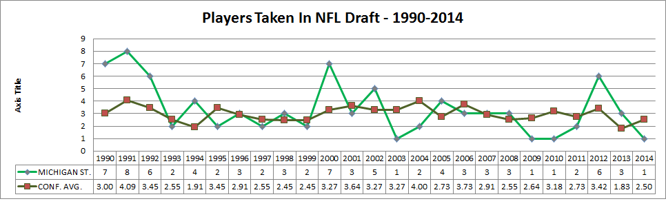
For kicks, let’s do Michigan State too:
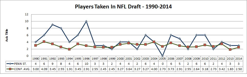
Penn State here:
And Wisconsin:
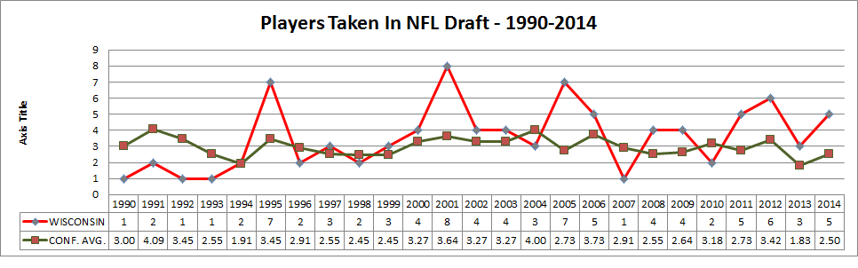
With some exceptions, Michigan State seems to perform at the average, whereas Ohio State has mostly remained firmly above it. This probably will not shock anyone who follows both our conference and the draft, of course, but there it is in graphic form. The graphs for Penn State and Wisconsin make think that another direction that this can go in is trying to correlate winning percentage to the number of players taken. That could end up being a dead end, but the question seems to arise, at least in my mind.
Although they are a recent addition, here’s how Nebraska would look against the yearly mean:
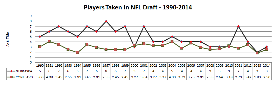
The 1990s were good times in other places as well.
CONCLUSION:
I don’t have one. Just the usual playing with numbers and answering weird questions.